Tuesday, 6 December 2011
Adding a splash of colour to long-gone grey skies
"I cannot pretend to be impartial about the colours. I rejoice with the brilliant ones, and am genuinely sorry for the poor browns."
Winston Churchill
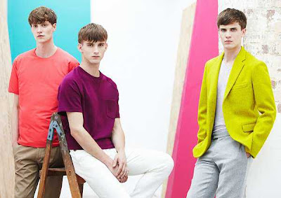
Ladies and gentleman I'm glad to finally announce that it’s high time you throw away those blacks and greys, and whip out some colours into your outfits. Truth is, colour-blocking is one of the biggest trends this season; it’s basically everywhere, from clothing to accessories.
Colour is the most basic and fundamental medium one can use to describe and express their moods. Express your feelings with your outfits; splash some colours on them to add character! Moods fluctuate on a huge continuum and I'm pretty sure one doesn't ever remain dark and gloomy all the time...
Lanvin Autumn/Winter 2011
Street Chic
Yves Saint Laurent Autum/Winter 2011
G.I.L Homme's Autumn/Winter 2011 collection showcased during Men’s Fashion Week in Singapore; the collection featuring a host of bright hues that graced the runway after a series of black outfits as though to announce the impending dearth of monotony. Now that's what I call splashing life with a bit of colour!
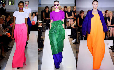
Jill Sander's Spring/Summer 2011 collection brought a whole slew of brights down the runway. This is the one time I’ll actually understand why editors wear shades during a fashion show... Just look at the amount of brights!
Not only was the Louis Vuitton's Spring/Summer 2011 collection inspired by the traditional Chinese apparel but also by their extravagant use of colour in the higher class of Chinese society back in the day. Think about the emperors and their bright yellow robes. Too awesome!!!
Colour-blocking is no new trend though, it has been seen in numerous seasons including Topshop Unique's Spring/Summer 2010, Richard Nicoll's Spring/Summer 2010, Moschino's Spring/Summer 2008, as well as in Marc Jacobs' Spring/Summer 2010 collections. Albeit it was only a subtle show of colours, notice the power and consistency... More especially, the impeccable sense intuition.
I know you're probably wondering whether throwing different-coloured garments together and calling it a day would work... No guys, it is way beyond that. To help you all out in getting through a kick-ass summer, and kicking ass while you're at it, here are a few quick tips to guide you along when trying to colour-block.
1. No more than 3 colours per outfit!
Keep the number of colours in your outfit to a maximum of 3, any more and you might look as though you just puked colours out.
2. Go crazy with the colours.
Create a clash of colours by all means! The "clash-ier" your overall look, the better! Remember to keep the colours bright and bold, not muted or pastels.
3. Minimise your amount of accessories...
With a whole bright and bold colour scheme, you don’t want to confuse the random on-looker by wearing too many statement accessories as well. Keep it simple. (Minimalism is another trend that works well with colour-blocking by the way)
According to Vogue, loud and proud colour combinations make for a dynamic, confident look. So with that said lads and lasses; follow these simple steps and you're guaranteed a visually coherent silhouette. Trust me...
Here's a simple example of a day in colour-blocking mode:
Style expert and host of TLC's “What Not to Wear” Stacy London shows ladies how to conquer our fear of color and use it to flatter our figures, regardless of shape!
'Work: The “colour block” print is the print most associated with "colour-blocking that looks like a Mondrian painting — literally, the look of graphic lines that create boxes on a garment. This does not need to be unflattering at all, and while it may seem like a tricky print to wear, it can actually work to flatter your figure. The cut of a style always dictates how flattering the item will be when worn. Try a sheath dress where the waistline hits slightly higher than your natural waist, if you carry your weight in your midsection. This print can create the appearance of a smaller waistline and a longer leg. In a relatively neutral color palette, this is an absolutely appropriate trend for the workplace. Try a bright-colored shoe to add some fun, yet still be professional in this look.
Weekend: Two solid colours and a neutral Use colour to your advantage. Colour draws the eye in first, so wear it on your body where you want the eye to go. If you carry your weight in your lower half, wear colour on the top half of your body for the most flattering silhouette. Try two coloured tops: a layering piece like a T-shirt and a button-down shirt/jacket as a completer piece, of equal brightness and with the same undertone. They become the focus of the outfit and you can define a waistline with a neutral belt for added emphasis. Try neutral-coloured pants in a universally flattering cut, a mid-rise straight-leg trouser. You can always preferably choose one with a light gold pinstripe. The pinstripe, while subtle, draws the eye vertically rather than horizontally, which creates the appearance of a longer, leaner leg line. Try adding a third, softer color in as an accent that is in contrast to the two main colors in your accessories. Think sprinkles on a sundae: They stand out but complement the outfit as a whole.
Day to evening: All solid colour
You can be adventurous and wear colour all over. You just want to be careful in what proportion! If you are petite, make sure to wear your colours in relatively equal visual measure so that you don't look completely overwhelmed by one colour. Also note that these are SOLID colors and not prints. While mixing prints is another big trend of the season, it isn't one to mix WITH colour blocking. Solid colours still look clean and geometric on petite people. Throwing in prints on top of multiple colours can look overwhelming on a petite frame. Try a top with two contrasting colors and bottoms, like a pair of shorts or a casual skirt, in one solid color. When you cut up a small frame with colour, you can help to define the shape of the body and call attention to it. Make sure the clothes aren't too drapey and that they are tailored to your body or we lose your shape entirely! Try adding a denim or neutral-coloured jacket to keep the outfit from looking overly childlike. Pair shorts with wedge sandals this season for a look that can take you from Saturday afternoon to Saturday night!
Evening: One bright colour as an accent We all love black for evening, but this season look for pieces with accents of bright colour! Try a black bustier with a colored strap (like PINK) and pair with a black mini-skirt or tuxedo pants. If you have a relatively straight frame, a bustier is a great way to visually add curves to the body, accenting the chest and creating a waistline. Try a ruffled or tiered mini-skirt to emphasize the curve on a straight hip. Try matching your accessories to the colour in your top for a bold graphic look.'
I think we all get it now, colour matters most this season. And as the Rachel Wolf quote goes,“Colour is fun, Colour is just plain gorgeous, a gourmet meal for the eye; the window of the soul.” Have fun this season folks, paint the town red!!! Or blue, or yellow for that matter...
Subscribe to:
Post Comments (Atom)


Loving the color-blocking and street chic steals ma attentioN !most ;)...
ReplyDeleteI know rite, its like a breathe of happiness without a single word or gesture needed to be made... #thumbsup
ReplyDelete